What is Viewport?
It's a term that is becoming increasingly familiar in modern web
design, yet it is still a concept that needs to be understood. In this article,
we will explore the definition and usage of the viewport in web design, how it
can be used to create a better browsing experience, and its potential pitfalls.
The viewport is the web page area the user can see. It is the part
of the page that the user interacts with – the part of the page that they can
scroll through, the part of the page that they can click on, and the part of
the page that displays information and images. All the elements of a website
are laid out within the viewport.
In most web designs, the viewport is a fixed size, meaning the
same amount of information is visible regardless of the device size. This means
that if the user is viewing the website on a small device, such as a mobile
phone, then the same amount of content will be visible as if they were viewing
the website on a larger device, such as a laptop or desktop computer. This can
lead to an unsatisfactory browsing experience, as the website may need to be
optimized for the user’s device size.
To ensure that the user can view the website in its entirety
regardless of the device size, the viewport can be set to scale to the device
size. This allows the website to be responsive, so the entire website can be
viewed regardless of the device's size.
Video indexing specific issues-Google
Google Search Console has upgraded its indexing report to
provide more specific actions and explanations concerning any issues related to
videos not appearing in the Google search results. This new report version
identifies three reasons for the "Google could not determine the prominent
video on the page" error. With this improvement, Google hopes to enhance
users' understanding and troubleshooting capabilities.
Google added these three new reasons for Indexing specific issues:
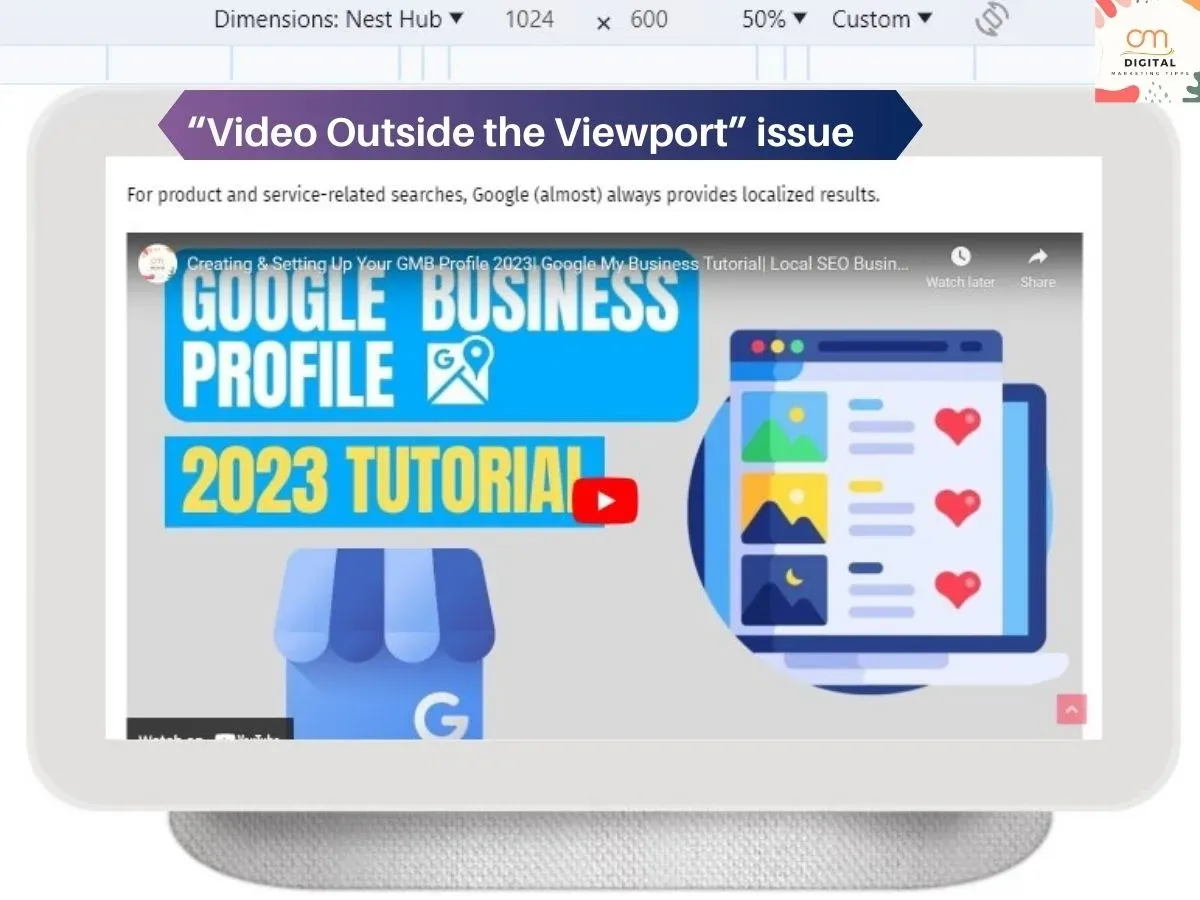
Establishing the Viewport:
The viewport is pivotal in web design, as it sets the size and
scale of a webpage's content. Adjusting the viewport allows users to
effectively access website content across various devices, such as desktop/laptops,
tabs and mobile phones. To ensure an optimal viewing experience, set the
appropriate width, height, initial-scale parameters. This will create a
sturdier framework for presenting your content on any device.
A standard mobile-friendly website typically includes the
following syntax:
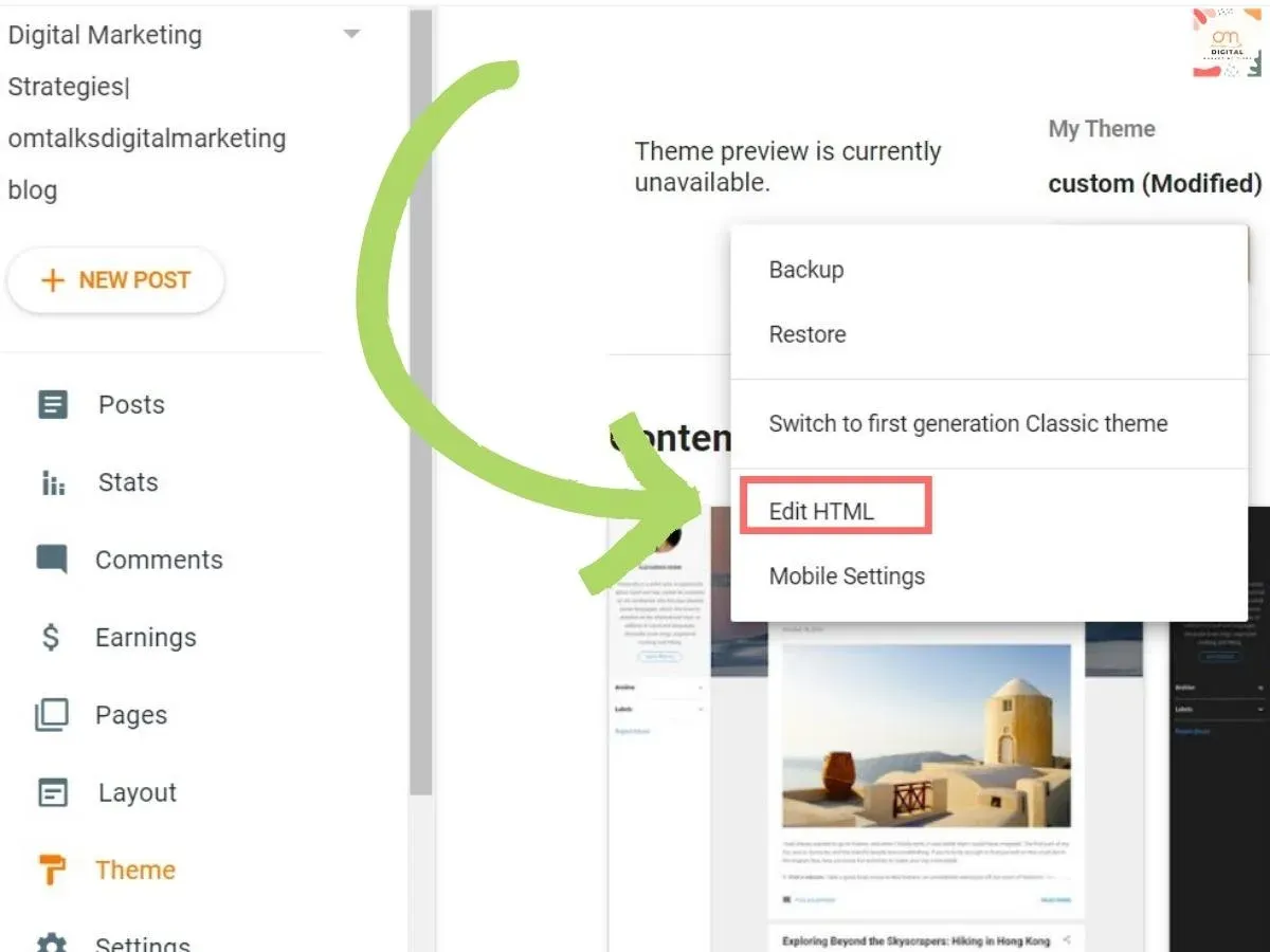
Click on the right triangle icon under Customize to open a list of
options. Before making any changes, it is advisable to download a “backup” of
your current theme in case anything goes wrong during the editing process.
Once you have a back-up saved, click on 'Edit HTML' and search for
the <head> tag.
Paste the following syntax just below <head> tag:
After pasting this code in the correct spot, be sure to click
'Save'. This will ensure that your meta tag is properly added.
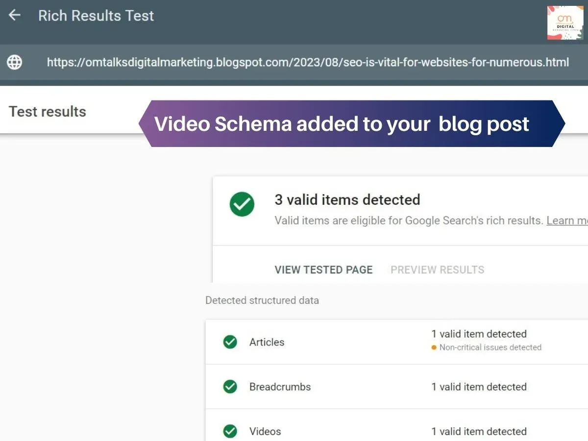
Enhance your blog post with Schema by following these simple steps:
The presence of video schema also adds another layer to your
content as users are more likely to engage with video than text-only posts. As
such, incorporating relevant multimedia into your content can help increase user
engagement and improve SEO ranking.
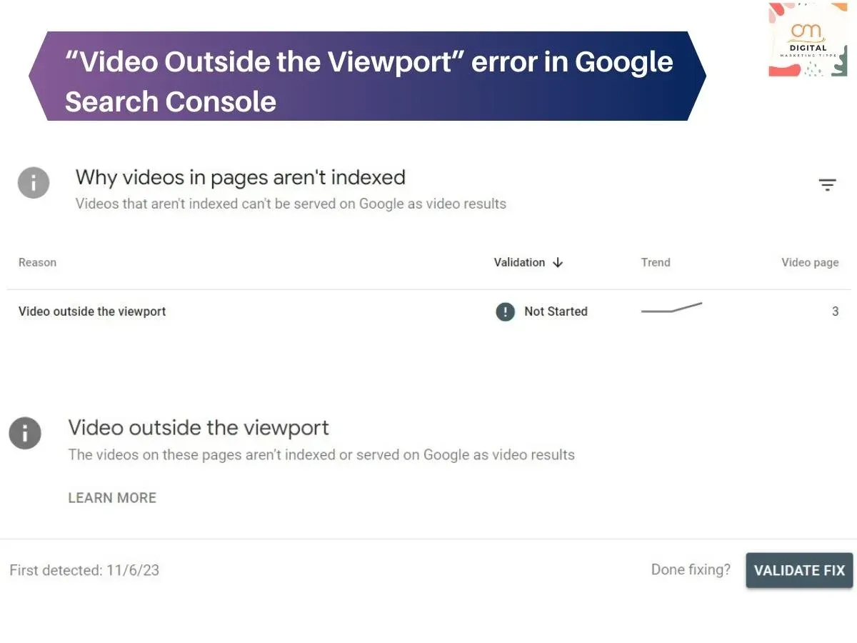
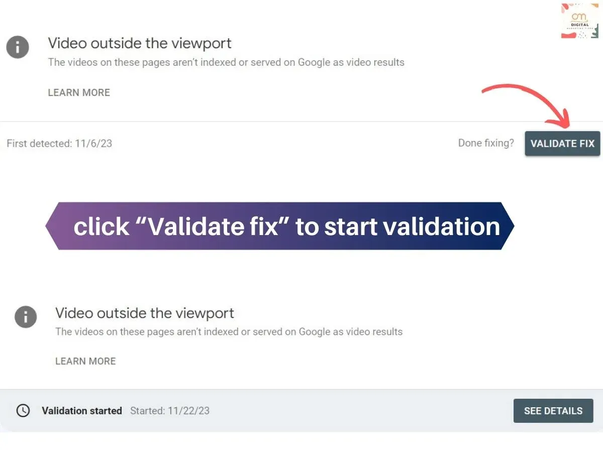
In order to address this page indexing error, please take the following steps:
1. Navigate to Google Search Console.
2. Go to the “Video Pages” section and click on the “Validate Fix”
button.
3. Please allow some time for Google's crawling process in order
for the modified web pages to be indexed successfully.
4. Once complete, review your results in the “Index Coverage”
report in Search Console and verify whether or not your issue has been
resolved.
In summary, by following the outlined steps, one can swiftly
resolve this issue in Google Search
Console.





0 Comments